Introduction
In this assignment we are told to create brand identity for ourselves, to help promote ourselves in the career of our choice. Our identity would help show people what you are about and who you are as a person and what interests you.I love to make things, anything that is creative and fun is exciting for me to see, when I see other peoples work I don't just see the design/illustration I see it for the time it took them to make it, the dedication they had to put into it and the hardship it may have taken to complete that. I love to be creative and I love creative things, and to put this into a symbol or a logo or even a brand will be tricky but that's what makes it fun.
Research
To do research I will need to look into multiple logos and brands for their identity and try to see how it worked for them, and why and then try to use the same method for myself and try out some ideas for myself, make variations of ideas and see which one is best.
As for the first inspiration I will be talking about some simple logos and what I like and don't like about them, this is to give me a better understanding of what I want from my own logo and the style I want to do.
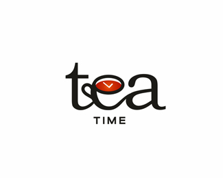 |
| Created by http://logopond.com/members/profile/showcase/130172 |
I like the idea and the concept it works
well, I like the fact it has the hands of the clock in the tea itself and its
also implemented into the lettering of the word "Tea" there is
nothing I don't like about it either, as the colours are great and it’s a
simple yet effect design. What I can take from this for my own idea is to have
a simple but effective design or at least try to have one.
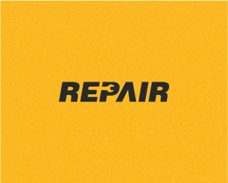 |
| Created by http://logopond.com/members/profile/showcase/109631 |
The idea for this logo once again is simple
and effective by having the logo of seem like simple text that is bold but have
the P hole in the shape of a wrench is a great idea. The text is bold and is
matching to the theme and is right in masculinity, shape and overall design. I
think I will also try to get my brand in the same style to be the logo and the
text one in the same.
 |
| Created by Unknown |
This idea is good, the concept is right and
all but the delivery is not too good, it’s a big bulky to be a logo and long in
height, if it had to be used on a website header for example it would not fit
or would be constrained because of it. So the only critique I have for it is
that the shape is off and is unbalanced. I would want my own to be able to fit
anywhere, and be a box or rectangle shape to fit anywhere on any medium.
 |
| Created by Unknown |
This logo idea is fine, it is
complex though is when a logo is complex it’s not as easy to recognise and when
a company or a business wants a logo they want it to be memorable, recognisable
and simple. This is not.
Research
Conclusion
In Conclusion for the research, I
will want my logo to be simple to remember and is
implemented if possible in a way with the text that I will use.
I will want it to be a consistent shape and not too long or wide to make it
unable to be used on some mediums or spaces, I would if possible want it to be
able to work with the text accompanying it.
Symbols
When you see a symbol, any symbol
for that matter a power icon, exit sign or the save icon for the program you
are using. They show you the meaning of clicking or using the symbol, without
using any text usually and you know what it does. I want that kind of symbolic
feel to my brand and make it easily recognisable to that standard. What I
want to show when you see my brand identity is creativity and creation. I need
to use a symbol or icon that shows it and is simple in characteristics.
| Created by Unknown |
 |
| Created by Unknown |
These symbols just by looking at them you can
easily tell what they are for and what reason, most of them can be universal
and used anywhere and still show meaning. Things like No Dogs, No entry and so
on.
| Created by Unknown |
These aren't icons or symbols but
are pretty cool. I like them because they have round corners and are consistent
in shape and symmetry, they are balanced in both design and colour and are
simple.
Brand Research
First of all what is a brand? A
brand is the identity and the image of the company or business it represents,
it is what is emotional about the company and what speaks for as a whole. To
have a good brand is to allow your customers know what
the company is all about. So why is a brand different from a logo? A
logo is not the same as a brand, because a logo is identifying the
company or business in its simplest form.
This image should give you a good
idea of what a brand, logo and identity is
| Created by Unknown |
No comments:
Post a Comment