"Win $5,000 with the Ultimate ‘80s Movie Poster Contest
Brought to you by GraphicStock, 99designs, and SitePoint.
GraphicStock, SitePoint, and 99designs have teamed up to bring you an amazing contest: the Ultimate ‘80s Movie Poster Contest! Design your own poster for a classic ‘80s film or take a recent movie and create an ‘80s style poster for it for your chance to win big!
First prize is an incredible $5,000, while the second prize winner will receive $1,000. The next 10 runners up will all receive a free year of GraphicStock (valued at $99)!*
Sounding good? Here’s exactly what you need to do:
1) Sign up for your free GraphicStock account and receive a 14 day access with 25 downloads from our incredible GraphicStock image library (no credit card required!)
http://gstock.co/x/80spostercontest
2) Create your own ‘80s-inspired movie poster, using at least one photo, vector or illustration downloaded from GraphicStock in your final design. You can create an ‘80s-style poster for a recent film, or design your own poster for a classic ‘80s movie.
3) Sign up as a designer on 99designs
https://99designs.com/signup
and submit your finished design to this contest page.
You’ll also get a free copy of The Designer’s Guide To Web Images, the ebook we’ve produced with SitePoint and 99designs. It’s a curated collection of articles covering must-know topics including copyright, font choices, image sourcing and more.
The Ultimate ‘80s Movie Poster Contest is open now and closes on Monday 16 November, 11:59pm PST. Don’t delay - life moves fast. If you blink you might miss it.
Rules
All entries MUST use at least 1 image from the GraphicStock photo library.
Any entries not using at least 1 image from the GraphicStock photo library will be disqualified.
☆ Eligible designs MUST NOT use copyrighted material from pre-existing movie posters.
(eg. Characters pulled from pre-existing movie marketing or posters, backgrounds, images, or fonts pulled from existing marketing materials for existing film properties.)
☆ Contest eligibility requires submitted artwork to be completely original and not a rework of copyrighted material."
I found this on the 14th of November, i had 2 days to make and research a poster for this contest.
Research
Research
As for research I decided to look at movie posters that have actually came out around the 80's and see the style, composition and design that they tend to look like for the majority of the time.
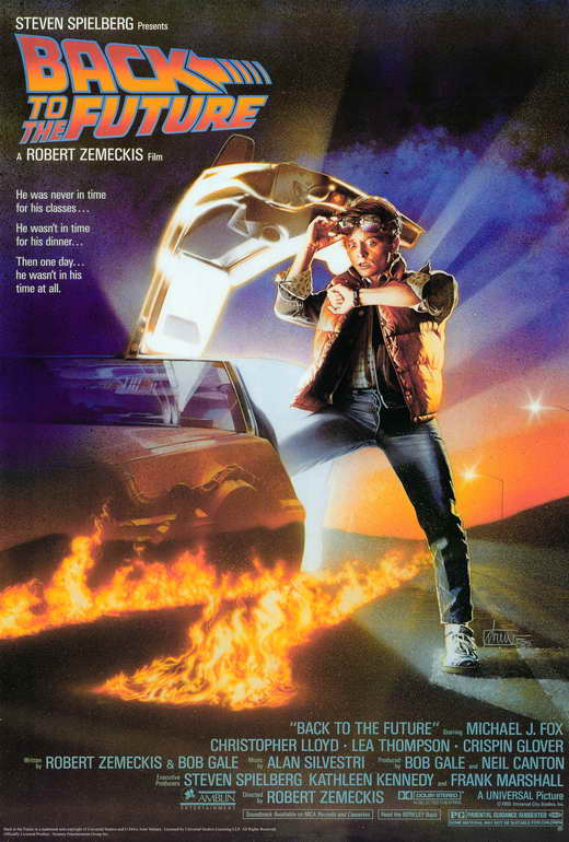
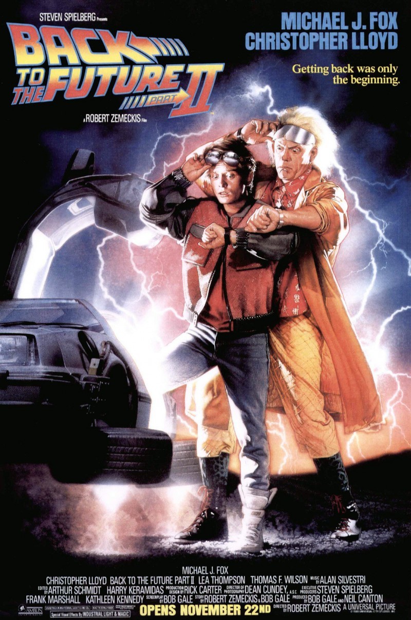


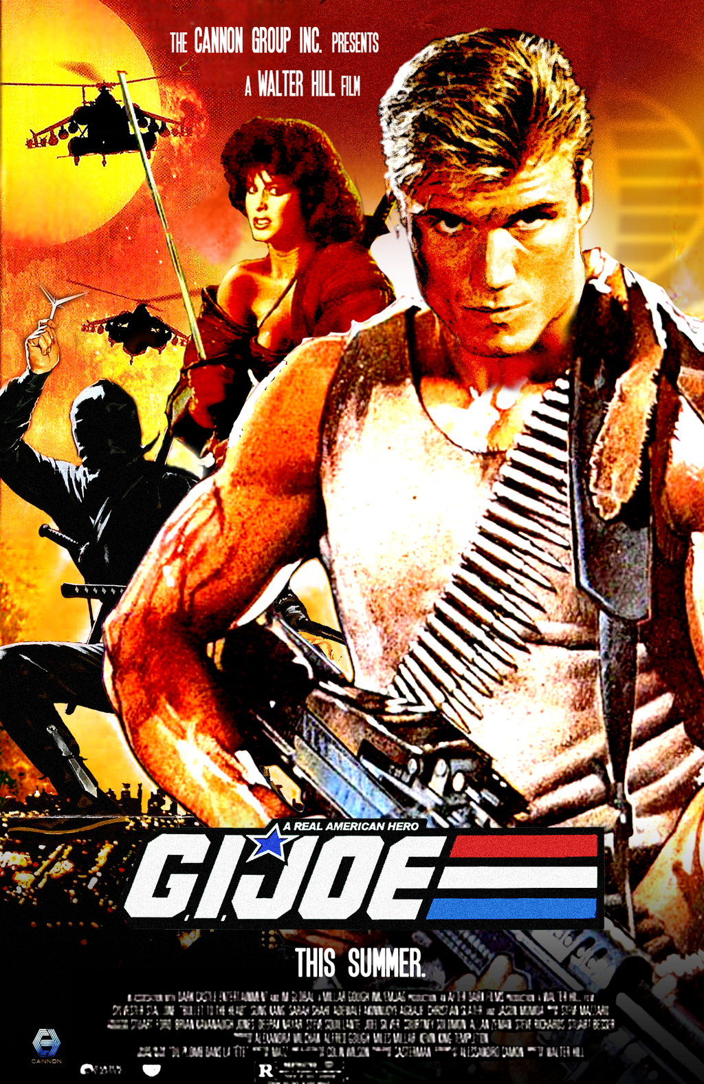
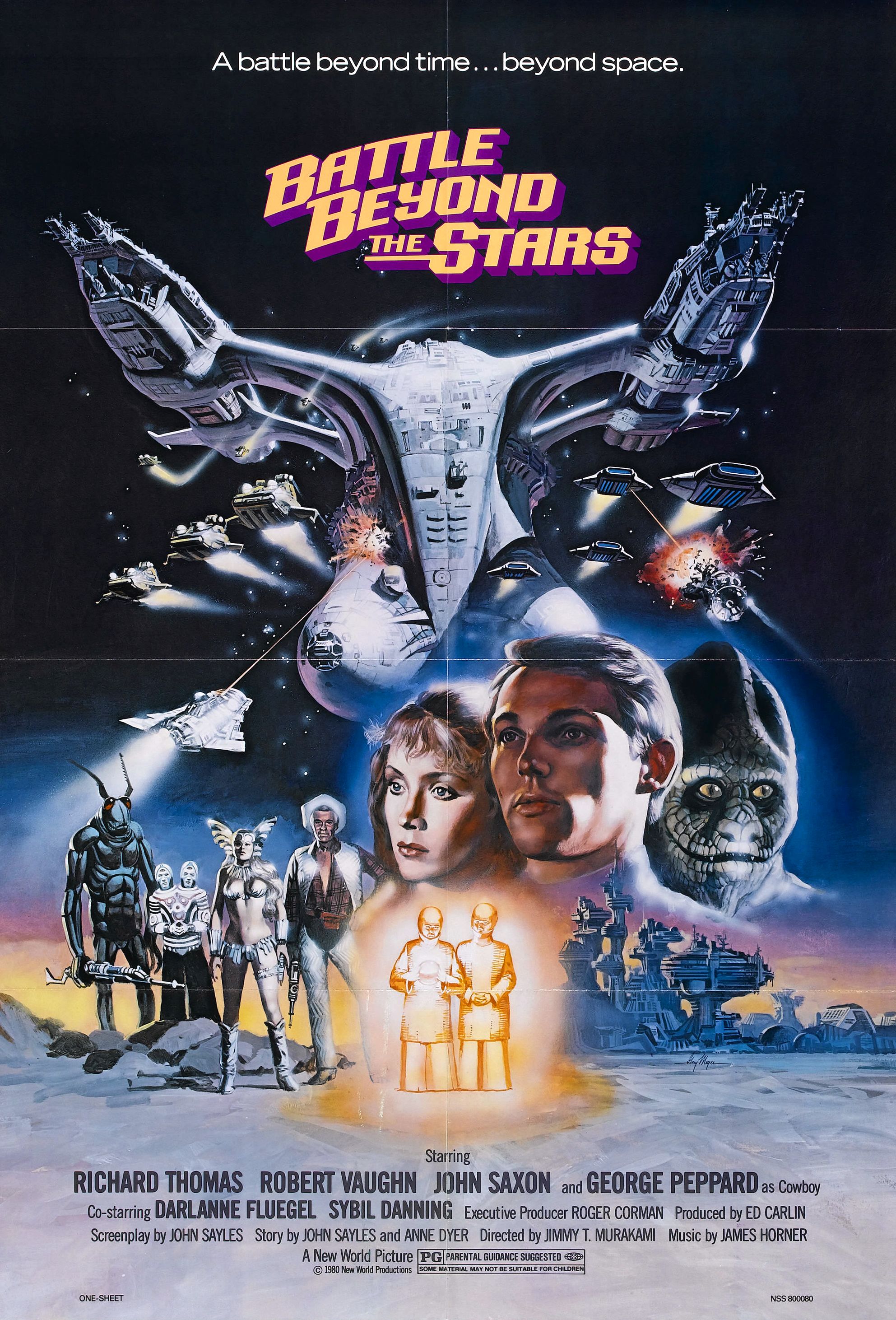
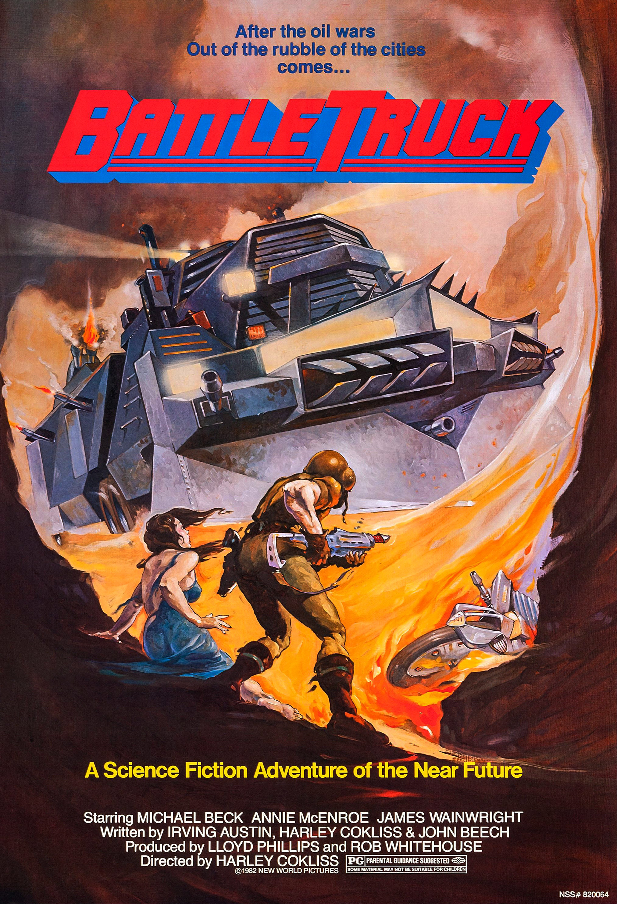
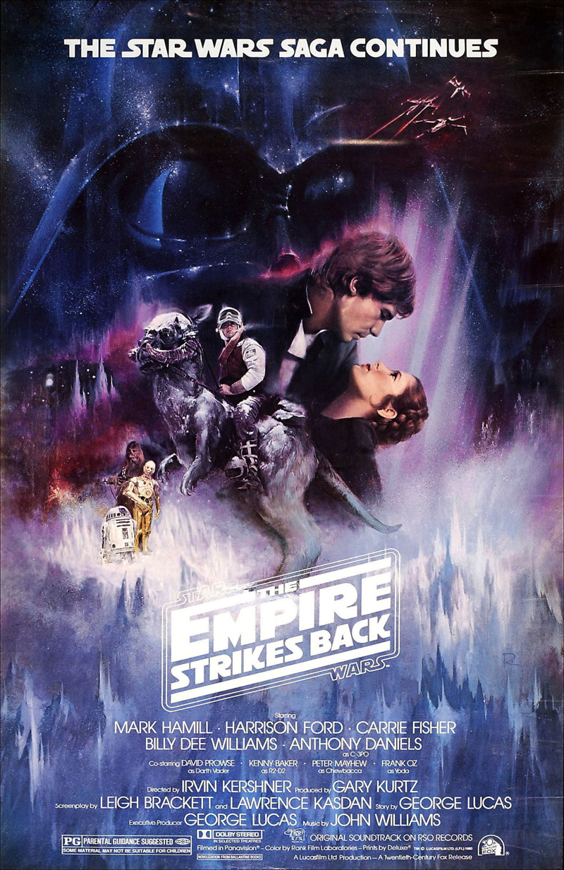
As for can see from the posters above they are vivid and eye catching, nothing like the simplistic designs of posters today. so what I learned from the posters I saw, what normally was the case.
Gradients - Gradients are strongly used in movies that are about action and adventure, you can see a lot of them use a variation of colours to draw the viewer in. they are blended softly and consist of 2 or more colours and are in the background.
Characters - The character is always on the front of the cover, if not the main character then all the main side cast of the film. this is once again to make it clear who is in the film and draw attention for the viewer to see or recognise a actor from the cover. What I also noticed was when there is a villain or a monster then that monster is used on the front cover also or alone to show and entice the viewer to go watch the film to find out more. They also has overlapping of the characters and blended them together. this was done a lot to be able to show all the characters of the film.
Colours - Colours are bright and vivid, these are strong use on the character himself as well as on the background, similar and gradient complementing colours are used for overall good colour choice to make it more brighter and eye catching at the same time.
Text - Film titles are mainly used near the bottom and also on the top, never in the middle or anywhere else in these movie posters. the centre is always dedicated to the images and illustrations for the movie. as for the directors, producers, cast and the small details that's at the bottom,and that is still done today in posters as its small not as important information.
My own 80's Poster - For my own poster I decided to go with the original Tron that came out in 1982. why? mainly because I enjoyed watching that movie as a kid and liked the style of it overall, and thought that would be a easy enough theme and movie to fit into a 80s style poster.
I looked at some screenshots of the movie to get a feel for the overall colour choice and vibrant it shows as the user watches it.

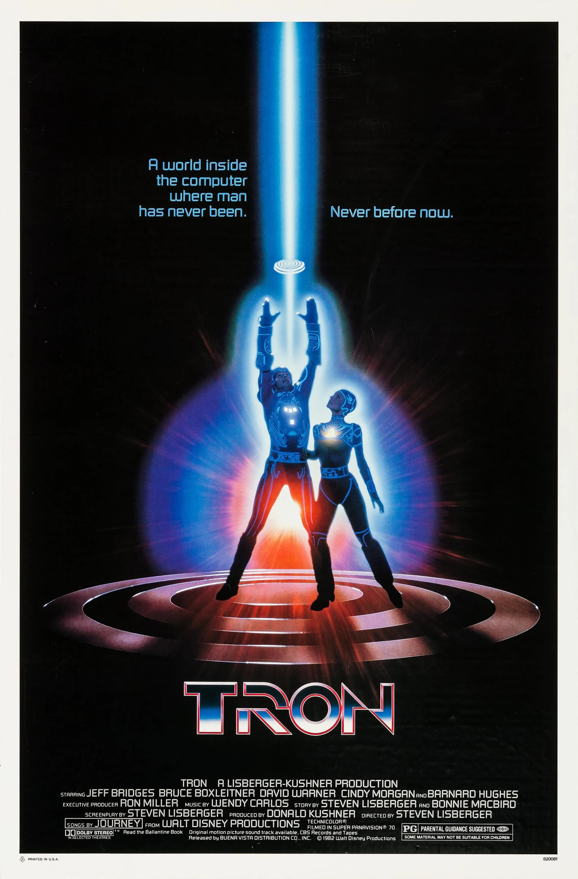
As you can see the theme is mainly blue, as in the good guys. and it is only red when its the bad guys so using blue and red in a mixture for the poster will show a difference and separation. there are a lot of grids, I plan to incorporate grids into the poster to show it's a virtual world, depending on if the grid and if its found on the graphic stock site.
Drawing from sketchbook for quick ideas

Drawing from sketchbook for quick ideas

Final Poster created -


End result with layers showing creation and composition
 |
Stock images used      |
Bibliography -
http://www.ebaumsworld.com/pictures/view/84575384/
http://www.allposters.co.uk/-sm/80-s-Movies-Posters_c98437_.htm
https://www.google.co.uk/search?q=80s+posters&espv=2&biw=1920&bih=955&source=lnms&tbm=isch&sa=X&ved=0ahUKEwiEm-3jxqXJAhUGtxQKHewVAb8Q_AUIBigB&dpr=1
--------------------------------------------------------------------------------------------------------------------------
Yumi Assignment website mock-up
For the second Assignment I have decided to revisit my Yumi Ice Cream Parlour website, I want to make this mock design into a live website design.


As for research while making the website mockup when i first created it, I wanted to give it a retro look and feel, so I wanted a theme to fit it. so I looked at various images and designs that gave a retro feel, see below for the collection of images.
Research


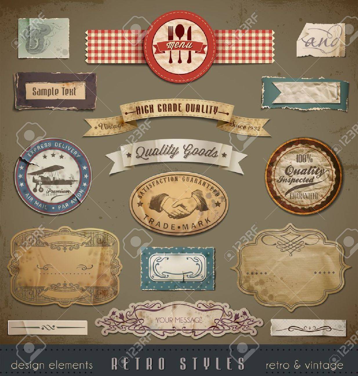


As you can see the style of a retro design, is to use mainly flat colours with some texture also. depending on the style you go with. it can be flat, textured, a slight 3D feel with soft shadows or a mix of these style for a retro feel. what makes it a retro feel is the slant of the design, as well as the colour choice which is a pallet feel that isn't too bright.
Website Coding - While coding both the CSS and HTML as well as some simple JavaScript, I did this myself, without using online resources only to use Jquery sliders. the CSS animations and transitions were created by myself using a trial and error approach. The hardest part I would say is to make the secondary content banners on the main index page. they had to be linked using different DIV tags and I needed to figure out new CSS attributes I've never used before.
Website Animation and Transition Demonstration
https://www.youtube.com/watch?v=nzueoHhtYK8
Behance
Bibliography -
https://www.google.co.uk/search?q=retro+designs&espv=2&biw=1920&bih=955&source=lnms&tbm=isch&sa=X&ved=0ahUKEwjSw6Hy7qfJAhWDchQKHTOKB7oQ_AUIBigB
http://www.awwwards.com/web-design-awards/sweez-1
http://www.awwwards.com/web-design-awards/italio-kitchen
http://www.awwwards.com/web-design-awards/the-next-super-hero
--------------------------------------------------------------------------------------------------------------------------
Icon Collection for Yumi Website
Sweet Icons for Yumi website is another Assignment I chose to do from the mock-up icons created in the Yumi design made on Photoshop, I wanted to make my own style and variation of them. So I wanted to make 9 all together as that was required for the website.
The style I wanted to do was a flat design for the icons, but have them have some sort of depth, so I added shadows and highlights where I saw fit on the food that I was creating and designing.
Research


My own icons for the collection that I created

Behance
Bibliography
https://www.google.co.uk/search?q=flat+icon+design&espv=2&biw=1920&bih=955&source=lnms&tbm=isch&sa=X&ved=0ahUKEwjwyqqggqjJAhUL2hoKHfJnDi8Q_AUIBigB
https://www.google.co.uk/search?q=flat+design&espv=2&biw=1920&bih=955&source=lnms&tbm=isch&sa=X&ved=0ahUKEwjKiO72qqrJAhVDVRQKHRvqALQQ_AUIBigB#
--------------------------------------------------------------------------------------------------------------------------
Gmail UI Redesign
Brief - Link to brief
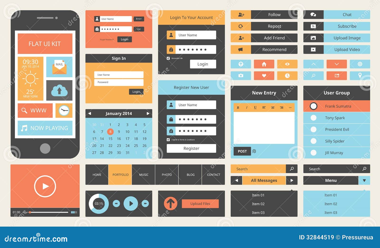
Research into flat design UI's and popular design choices


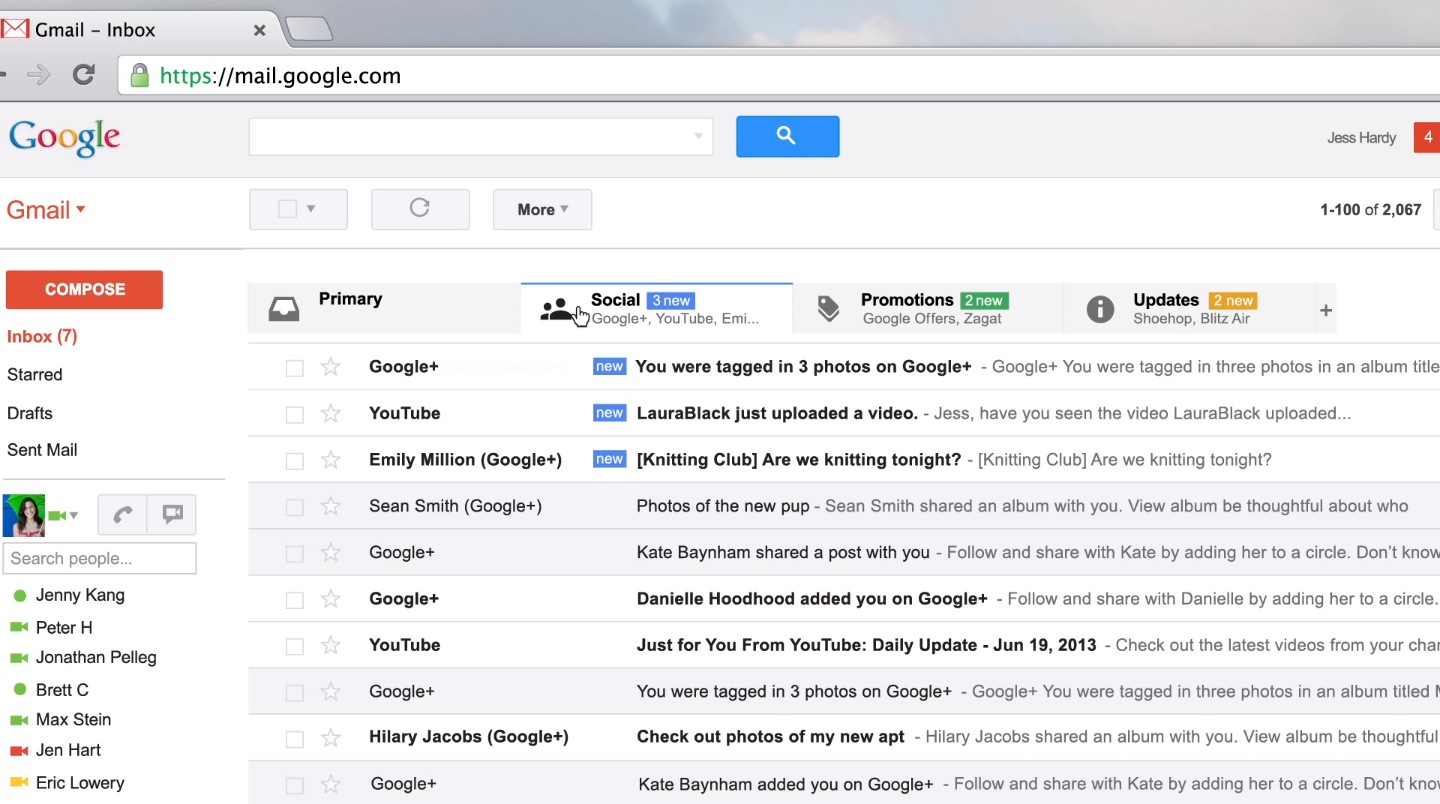
Current Design of Gmail UI

Social Tab page - Showing Right click and Hover options potential
Profile Pictures -
Bibliography -
http://briefbox.me/design-brief/re-design-gmail-ui-layout/
https://www.google.co.uk/search?q=UI+design+2015&hl=en-GB&biw=1920&bih=955&site=webhp&source=lnms&tbm=isch&sa=X&ved=0ahUKEwjN2o3K1qzJAhWBWhoKHQJWCAsQ_AUIBigB#imgrc=9P5fzs6pUt02RM%3A
http://three29.com/design-2/top-ten-uiux-design-inspiration-sites-of-2015/
http://gotgroove.com/ecommerce-blog/7-top-ui-design-trends-2015-beyond/
Npower D&AD Brief
"Pick one of the following D&AD briefs and produce three ‘concept’ solutions to one of these briefs. Each concept must demonstrate a significantly different idea from the others. One on the ‘concept’ solutions must be text only, one must be image only, and one must be a combination of text and image. All concepts must have the client’s logo and there strap line e.g. the National trust strapline is 'Time well spent'."
Concept Idea
Concept Idea for the app will be for it to be available to the customer to use. this app can be linked to the customers smart meter and allow them to control the smart meter anywhere and see its display from their phone if they have a connection. The app will also allow them to control their homes anywhere they like. they can control their heating, electricity in any room or set-up they need and also their individual devices with a custom set-up.
The apps design is to be fitting with the companies colour scheme and design, it is to be simple to use and has the needed information for the customer to see and take action from. For example they can set a limit of how long the internet stays on for. and once it reaches that time of day, it can turn off automatically and not draw any more energy.
The App will allow the user to:


Object and text based

Behance
Bibliography
https://www.behance.net/gallery/15418575/D-AD-201314-npower
https://www.behance.net/gallery/15448115/NPower-Heatview
https://www.behance.net/gallery/15383625/NPower-Save-Together
https://www.behance.net/gallery/17711643/Synergy-npower-D-AD-Nomination
http://www.dandad.org/en/new-blood-awards-2015-recap-npower-challenge/
http://www.dandad.org/search/?q=brief%3Anpower+year%3A2015
--------------------------------------------------------------------------------------------------------------------------
Yumi Assignment website mock-up
For the second Assignment I have decided to revisit my Yumi Ice Cream Parlour website, I want to make this mock design into a live website design.
Homepage mock-up design

Menu Page mock-up design

As for research while making the website mockup when i first created it, I wanted to give it a retro look and feel, so I wanted a theme to fit it. so I looked at various images and designs that gave a retro feel, see below for the collection of images.
Research
As you can see the style of a retro design, is to use mainly flat colours with some texture also. depending on the style you go with. it can be flat, textured, a slight 3D feel with soft shadows or a mix of these style for a retro feel. what makes it a retro feel is the slant of the design, as well as the colour choice which is a pallet feel that isn't too bright.
Website Coding - While coding both the CSS and HTML as well as some simple JavaScript, I did this myself, without using online resources only to use Jquery sliders. the CSS animations and transitions were created by myself using a trial and error approach. The hardest part I would say is to make the secondary content banners on the main index page. they had to be linked using different DIV tags and I needed to figure out new CSS attributes I've never used before.
Website Animation and Transition Demonstration
https://www.youtube.com/watch?v=nzueoHhtYK8
Behance
Bibliography -
https://www.google.co.uk/search?q=retro+designs&espv=2&biw=1920&bih=955&source=lnms&tbm=isch&sa=X&ved=0ahUKEwjSw6Hy7qfJAhWDchQKHTOKB7oQ_AUIBigB
http://www.awwwards.com/web-design-awards/sweez-1
http://www.awwwards.com/web-design-awards/italio-kitchen
http://www.awwwards.com/web-design-awards/the-next-super-hero
--------------------------------------------------------------------------------------------------------------------------
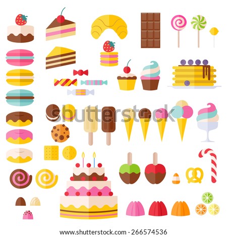
Icon Collection for Yumi Website
Sweet Icons for Yumi website is another Assignment I chose to do from the mock-up icons created in the Yumi design made on Photoshop, I wanted to make my own style and variation of them. So I wanted to make 9 all together as that was required for the website.
The style I wanted to do was a flat design for the icons, but have them have some sort of depth, so I added shadows and highlights where I saw fit on the food that I was creating and designing.
Research
My own icons for the collection that I created
What made me choose this art style and method was, that I liked he long shadow effect that some icons used and the fact they were in a circle kept the design confined as well as simple and within its on region which was clear and similar to a button. That's why I wanted these to be similar to a pin/button effect so when the user rolled over they would animate more better.
Bibliography
https://www.google.co.uk/search?q=flat+icon+design&espv=2&biw=1920&bih=955&source=lnms&tbm=isch&sa=X&ved=0ahUKEwjwyqqggqjJAhUL2hoKHfJnDi8Q_AUIBigB
https://www.google.co.uk/search?q=flat+design&espv=2&biw=1920&bih=955&source=lnms&tbm=isch&sa=X&ved=0ahUKEwjKiO72qqrJAhVDVRQKHRvqALQQ_AUIBigB#
--------------------------------------------------------------------------------------------------------------------------
Gmail UI Redesign
Brief - Link to brief
- "Well, if you’re anything like me, you use Gmail as it’s easily the best email platform going. The current design works well and is cleverly thought out, but pushing yourself to recreate a heavily user interface focused design like this can really help to push your design skills and practice your UI layouts that often get missed out when working on improving as a graphic designer. Begin by thinking out your new design, are you going to keep all elements in the same place? Are you going to hide and show certain elements on certain user interactions? Either way, get creative and show us ya skills using the existing Gmail content as a starting point."
Research into flat design UI's and popular design choices
Current Design of Gmail UI

The layout for the current Gmail is fine, but there can be improvements made to it to make it a more easier and convenient for the user. for example the right click allows you to delete an email but not much else. it would be a good feature to add, Forward, Reply, Read, Flag and more all from a right click of an email or emails.
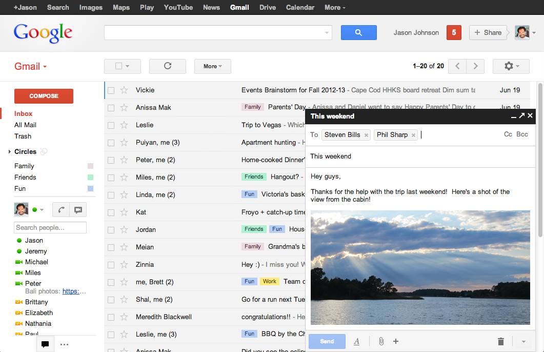
All the emails are blended together, there would be a good way to identify from an icon of the user who sent it with they profile picture on the email bar, and then be easily finding them and managing them if needed.
Colours of the UI are desaturated and boring, they are mainly grey and has very little colour, if the UI had a bit of a colour code to it. for example when a email is unread it would be one colour as a pose to another colour for the email if it was read, important, flagged etc.
To incorporate the Google colours into the scheme would be nice. it would with a theme and would be a great way of managing them. for example if you had a certain group, you can assign them a colour to see it better from a cluster of them and find it much easier.
Sometimes you really just need to know the time from a glance, so incorporating that into the design would be a of great help and saves the time and trouble of opening an email one by one from a cluster from the same person to see which one came at a specific time for example.
New UI design and colour scheme
Primary Email Tab
 |
| The UI redesign was mainly to add some more better colours into the design since the original is more grey and dull compared to it. I wanted to make it much moire easier to manage your emails and see clearly which is email is from who. and then you can do what you want with it anyway you want. more then one way. |
Tabs -
 |
| Tabs originally were very blended together, hard to tell which ones is which and so on. so I made it much more of a easier identification to colour then just by text to identify the types of emails the user receives. All three of the colours are straight from the colour pallet of the Google logo so its a consistent colour scheme. |
Colour scheme -
 |
| As I stated earlier I wanted to make it a much more lively colour scheme for the user to work with as well as be able to manage and sort their email with much more ease. I wanted to have the colour as a big helper in the management of the email and identification of emails and sort-ability. I wanted to test out a more darker version of the UI for a bit of a change from the white and bright Google recognition. This would also be in the settings to change it from dark to a white and bright version if so the user wishes to. the buttons and colours of the UI would remain the same, the only thing would be the text and background button colours to be inverted and adjusted. |
Selection -
 |
| Selection of the email I wanted to have it something different then just check boxes so I made it a bit more modern and have it represented with Ticks in circles, its different and a bit more newer and something different. So when the user needs to select emails the faded tick is inverted in colour and with full opacity. |
Options -
 |
| The original options to take action with emails and more were too generic and simple. I wanted to add a more iconic feel to the menu at the top, so I introduced some simplistic icons and added a similar colour scheme for each as in the logo to make it consistent. |
 |
| Here its shown how the colour of the UI can change depending on which tab you are on and if the user has new emails or not. I am also showing the right click on a email to show what kind of options the user will have once they do. I am also showing the hover options on the date. As you can see the new emails show up as green instead of blue to make it more animated and colourful. They would be yellow if the user had been on the promotions tab and had received a new email on there. The highlighted emails will have their email boxes highlighted slightly with the text inside become bold as well as have the tick next to them turn inverted and clear indication you have the email highlighted and selected. |
Right Click -
 |
| The right click originally did not have many options that would have been useful to the user, sometimes just right clicking and having options in more then one location is convenient. so that's what I did for the right click in the UI redesign, the same options and a bit more to any single/multiple emails you have right clicked. I also wanted this to be a unique, so I added the icons on here too. |
Profile Pictures -
 |
| The Profile pictures next to the emails in the lists would be a big help in identifying amongst a list how many you got from a certain user and when you did. you can find them much easier and simpler. |
Hover Options -
 |
| I added a little option so when you hover on the time it would show the time, date, day and month as well as the time you received it. this would be the same case for attachments, once you hover over the paper clip icon it will show you what's attached by name of file. |
Bibliography -
http://briefbox.me/design-brief/re-design-gmail-ui-layout/
https://www.google.co.uk/search?q=UI+design+2015&hl=en-GB&biw=1920&bih=955&site=webhp&source=lnms&tbm=isch&sa=X&ved=0ahUKEwjN2o3K1qzJAhWBWhoKHQJWCAsQ_AUIBigB#imgrc=9P5fzs6pUt02RM%3A
http://three29.com/design-2/top-ten-uiux-design-inspiration-sites-of-2015/
http://gotgroove.com/ecommerce-blog/7-top-ui-design-trends-2015-beyond/
Npower D&AD Brief
"Pick one of the following D&AD briefs and produce three ‘concept’ solutions to one of these briefs. Each concept must demonstrate a significantly different idea from the others. One on the ‘concept’ solutions must be text only, one must be image only, and one must be a combination of text and image. All concepts must have the client’s logo and there strap line e.g. the National trust strapline is 'Time well spent'."
Concept Idea
Concept Idea for the app will be for it to be available to the customer to use. this app can be linked to the customers smart meter and allow them to control the smart meter anywhere and see its display from their phone if they have a connection. The app will also allow them to control their homes anywhere they like. they can control their heating, electricity in any room or set-up they need and also their individual devices with a custom set-up.
The apps design is to be fitting with the companies colour scheme and design, it is to be simple to use and has the needed information for the customer to see and take action from. For example they can set a limit of how long the internet stays on for. and once it reaches that time of day, it can turn off automatically and not draw any more energy.
The App will allow the user to:
- Control their Home I.E Heating, Electricity, Devices and more.
- Check Usage for the day/week or per hour
- Control the smart meter
- Pay bills
- Submit meter readings
- Get advice on saving money custom crafted to how much their use
- Get promotions based on their usage and current situation
By the D&AD briefs I have looked at already I wanted to make their App promotion to show potential without being too informational, it can get customers interested in the App without many words but by looking at the picture.
Text

Object based

Object and text based

Behance
Bibliography
https://www.behance.net/gallery/15418575/D-AD-201314-npower
https://www.behance.net/gallery/15448115/NPower-Heatview
https://www.behance.net/gallery/15383625/NPower-Save-Together
https://www.behance.net/gallery/17711643/Synergy-npower-D-AD-Nomination
http://www.dandad.org/en/new-blood-awards-2015-recap-npower-challenge/
http://www.dandad.org/search/?q=brief%3Anpower+year%3A2015