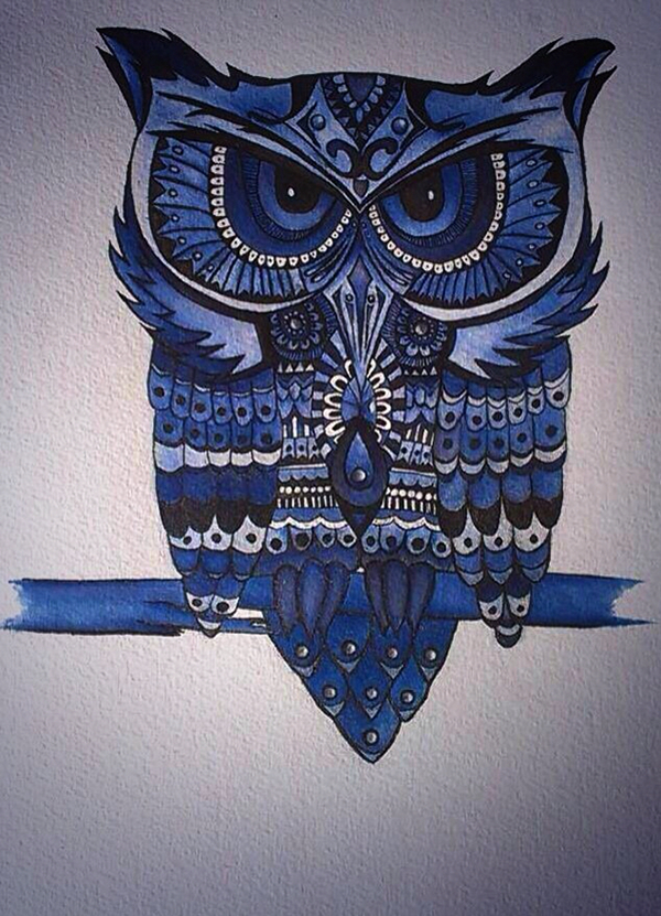
When working on a design or illustration the key when making certain designs with consistency is the symmetry that it has the designs that work with symmetry in a way for them to work is to have them be consistent in space that the objects/parts of the graphic are apart. a example for this I can give for the following.

Golden Owl - created by https://www.behance.net/ComfertZoneTrauma
As you can see this owl is symmetrical and the space for the individual parts of the owl are evenly spaces and apart. it is keeping a consistent design and space for the parts of the own such as the features and wings.
The work we did today was to make our own symmetrical design or illustration in illustrator by creating one half and then grouping the objects and then reflecting them on the opposite side. I didn't know what I was making till I started to see a figure emerging from the random shapes I was placing.
So this is what I ended up making a robot, he has no name but is symmetrical and is consistent in design. I had used a mixture of the basic shapes and the path finder tool to cut shapes and intersect them from one another to create this robot.

No comments:
Post a Comment