I will also be showing research below into many different subject matters that will help show camera shots, software, and common film making practice that can help show understanding.
I will be going into detail and showing research into the following :
1. Framing techniques
2. Filming styles
3. Editing techniques
For my final project I have decided to make a eco car, this car will be based off the lykan for its looks but it mainly is being created to prove that a wide range of energy generating technology can be implemented into the car to have it able to then be self rejuvenating, so everything about this car is to maker it renew its energy in one way or another. this should lead the path way for other car manufactures to do the same for their cars to make a difference.
Since I have already modeled the car it will have the be the post process effects and techniques I use after the car is rendered. this will be placing it into Photoshop to make the car ad campaigns and it will still show my thought process for this as well as the way I work also.
Framing Techniques
There are so many framing techniques to cover, so I will just cover a few of the ones that are common with today's productions.
This is where the subject in question is circled by the camera to usually either give a sense of space or to show the character for the first time.
Ariel shots are used to show a landscape or location from a helicopter or building to show a wide scene. this can be used to introduce the location.
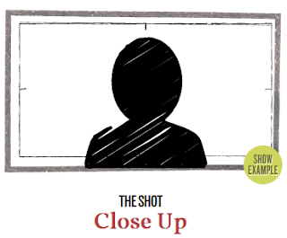
Close up shots are used to show the subject face in more detail to show their expression or feelings for the current on-going events happening in the film.
Handheld shots are when the camera is not a on a Dolly or tripod and is instead hand held and has the natural hand shaking movement as the subject is looked at or followed. this gives a sense of natural video recording to show amateur recording effect.
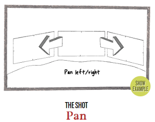
This shot is when the camera is continuously moved to the left from the right or vice versa, this is commonly used with car chases to show distance over time and speed.
A shot from a hydraulically balanced camera that allows for a smooth, fluid movement. this is used to follow a subject without much shakiness from a handheld being used or dolly which gives a more linear feel.
A shot that follows a subject be it from behind or alongside or in front of the subject. Not the same as a panning show as this is more smooth and linear then a faster pace.
Whip pan shot is a substantially increased shot from left to right, this is show a quick transition from one subject to another. Whatever is in-between is blurred and hard to tell, this short can be easily created with motion blur generated effect in post production software.
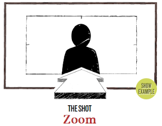
A shot deploying a lens with a variable focal length that allows the cinematographer to change the distance between camera and object without physically moving the camera. Also see Crash Zooms that do the same but only quicker.
Filming Styles
Difference between genre and film style
Film style is distinct from film genre, which categorizes films based on similar narrative structures. For instance, Western films are about the American West, love stories are about love, and so on.Film style categorizes films based on the techniques used in the making of the film, such as cinematography or lighting. Two films may be from the same genre, but they will probably look different based on the film style. For example, Independence Day and Cloverfield are both sci-fi, action films about the possible end of the world.
However, they are shot completely differently, with Cloverfield using a handheld camera for the entire movie. Films in the same genre do not necessarily have the same film style.
Therefore, film genre and film style are distinct film terms.
Film styles are recognizable film techniques used by filmmakers to give specific changes or value to their work. It can include all aspects in making a film: sound, mise-en-scene, dialogue, cinematography, or attitude
You can tell a film by the way it is filmed with its framing and choice of certain effects, colour, scene, or attitude, you can is tell who directed the film if you pay close attention to the directors filming style choices enough.
1. Wes Anderson - Director of Moonrise Kingdom, The Royal Tenenbaums, and last year’s The Grand Budapest Hotel.
He likes to use a lot Static camera angles an shots, he keeps the camera stationary, a lot of directors don't like to do this since it takes away a three dimensional feel from the movie. But that's was Wes Anderson likes about it and it works for his films.
2. Martin Scorsese - Director of Who's That Knocking at my door?, Taxi Driver, and Goodfella's.
Martin likes to use slow motion, long tracking shots and use of popular music at the time of creating the film, these are the three things that come into mind for his visual style. for the film "Who's that knocking at my door" he used slow motion to heighten moments in the film, particularly during scenes of psychological duress.
3. David O.Russell - Director of The Fighter, Silver Linings Playbook and American Hustle.
This Director likes to use Steadicam rigs, this is because he likes to use increased camera movement, such as towards or away and even around the characters to imbue the frame with energy. He tends to do this because it gives a smooth tracking shot which can be handled by the operator.
4. Zack Snyder - Director of 300, Watchmen and Man of Steel.
Zack Also les to use Slow motion but he does it his own way by combining into a shot, Slow , Normal and Fast motion. the kind of slow motion that Snyder pioneered can be seen in nearly every action film, what's more important is how he establishes the shot and continues to shoot action scenes as a whole.
5. Tim Burton- Edward Scissor Hands, Batman Returns, Corpse Bride
Coming from an art and animation background, the first thing you’ll notice in Burton’s films is a strict adherence to gothic color palettes, production design, and costume design. In general, Burton’s film and production tend to employ designs that harken back to expressionist filmmaking, specifically German filmmakers like Fritz Lang or Robert Wiene.
Editing techniques
Match Cut - A match cut, also called a graphic match, is a cut in film editing between either two different objects, two different spaces, or two different compositions in which an object in the two shots graphically match, often helping to establish a strong continuity of action and linking the two shots metaphorically.
Match Cut - A match cut, also called a graphic match, is a cut in film editing between either two different objects, two different spaces, or two different compositions in which an object in the two shots graphically match, often helping to establish a strong continuity of action and linking the two shots metaphorically.
Flash Cutting - This is when sequences are short in duration of the shots are very brief, this is also known as short cut. this is when a cut that has a very shoty length usually less than two seconds.
Cross cutting - Editing that alternates shots of two or more lines of action occurring in different places, usually simultaneous.
Discontinuity editing - Any alternative system of joining shots together using techniques unacceptable within continuity editing principles.• Possibilities include mismatching of temporal and spatial relations, violations of the axis of action, and concentration on graphic relationships. See elliptical editing, intellectual montage, non-diegetic insert.
Elliptical editing - Shot transitions that omit parts of an event, causing ellipsis in plot and story duration.
Jump Cut - An elliptical cut that appears to be an interruption of a single shot. It occurs within a scene rather than between scenes, to condense the shot.• Either the figures seem to change instantly against a constant background, or the background changes instantly while the figures remain constant.
Overlapping Editing - Cuts that repeat part or all of an action, thus expanding its viewing time and plot duration.
I can use various editing techniques from the following as well as some others. When it comes to making my own video to show my process. I will be using the relevant editing techniques that can how my work process in the best way possible.
Bibliography
http://www.lavideofilmmaker.com/filmmaking/film-techniques.html
http://en.wikipedia.org/wiki/Cinematic_techniques
http://www.slideshare.net/kscraps88/editing-techniques-15915736
http://www.skwirk.com/p-c_s-54_u-251_t-647_c-2411/camera-shots-angles-and-movement-lighting-cinematography-and-mise-en-scene/nsw/camera-shots-angles-and-movement-lighting-cinematography-and-mise-en-scene/skills-by-text-type-film/film-overview
http://www.empireonline.com/features/film-studies-101-camera-shots-styles
http://www.cheatsheet.com/entertainment/7-modern-directors-and-their-distinctive-visual-styles.html/?a=viewall
Overlapping Editing - Cuts that repeat part or all of an action, thus expanding its viewing time and plot duration.
Invisible Editing - Editing that is so smooth that viewers become engrossed in the movie and don’t notice the individual cuts.• Also referred to as seamless editing.
Line Cut - Tape of the switches from one camera angle to the other that the multiple cam director called out as the show was shot.
Split Edit - A video editing term for overlap. In a split edit the audio and video edit do not start at the same time; either video or audio is delayed. Also called an L cut or a delayed edit.
I can use various editing techniques from the following as well as some others. When it comes to making my own video to show my process. I will be using the relevant editing techniques that can how my work process in the best way possible.
There will be moments where the video will be sped up to show parts other then development from start to finish. The Time Lapse is not for what I do to achieve the final result its more to do with the how it becomes the final result.
TimeLapse -
https://vimeo.com/130072875
HyperLapse -
TimeLapse -
https://vimeo.com/130072875
HyperLapse -
Bibliography
http://www.lavideofilmmaker.com/filmmaking/film-techniques.html
http://en.wikipedia.org/wiki/Cinematic_techniques
http://www.slideshare.net/kscraps88/editing-techniques-15915736
http://www.skwirk.com/p-c_s-54_u-251_t-647_c-2411/camera-shots-angles-and-movement-lighting-cinematography-and-mise-en-scene/nsw/camera-shots-angles-and-movement-lighting-cinematography-and-mise-en-scene/skills-by-text-type-film/film-overview
http://www.empireonline.com/features/film-studies-101-camera-shots-styles
http://www.cheatsheet.com/entertainment/7-modern-directors-and-their-distinctive-visual-styles.html/?a=viewall


